-
HighPerformanceDesktop and phonecharts-1
The demo clips weigh 200 MB and are encoded far larger than they are shown
The page carries 22 clips on sahi.com's CDN, 200.2 MB together (measured 11 Oct 2026). 'Use New Script' is 17.7 MB to fill a 588×471 box; the phone Drawings clip is 17.4 MB and the two AI Indicators clips 15.5 and 17.2 MB. Desktop clips are encoded at 3364×2696 and drawn at 841×674, sixteen times the pixels of the box; phone clips are 1760×2400 for a box 358px wide. Pressing play once on a phone costs 4 to 17 MB of mobile data, and the files carry no Cache-Control header.
Our copy: Nothing streams until you press play: scrolling the whole page fetches no clip at all (measured). Then only that clip loads, one plays at a time, and it pauses when it scrolls away. The files stay on sahi.com's CDN, so re-encoding them at the size they are shown is for the SAHI team.
-
HighVisualDesktop and phonecharts-2
Every clip sits frozen behind the browser's control bar, and arrives empty
No clip plays by itself and none has a play button: each shows the browser's own control bar reading 0:00 across the bottom of its poster, while SAHI Scalper uses a branded play button for the same job. The server sends every clip as an empty video tag (no poster, no source; both are added by script), so on a slow phone or with script blocked the Custom Indicator and charting demos are blank grey rectangles.
Our copy: Posters are in the HTML. One SAHI play button starts a clip and turns into a pause button in the corner; a click on the clip also plays or pauses it. In the dark theme each clip's baked off-white margin is cropped, so it sits on a dark plate instead of in a white box. Without script the browser's controls still work.
-
HighContentDesktop and phonecharts-3
'1-Tap Buy/Sell' is captioned with the home page's text about personalising the homepage
In 'Lightning fast SAHI charts' the first control, 1-Tap Buy/Sell, is the one selected when the section opens, and its caption reads 'Personalize your homepage layout to match your trading style. Set up your workspace the way you want it, with just the tools you need.', the home page's Personalised Trading copy. It has nothing to do with buying or selling from the chart.
Our copy: It carries SAHI's own 1-Tap description, from step 4 of SAHI Scalper: 'Execute market orders instantly or place limit and trigger orders directly from the chart, all with a single tap.'
-
MediumNavigationDesktop and phonecharts-4
'Join Waitlist' sends readers to SAHI's staging server
The Join Waitlist button under Write with Kyro links to kyro.uat.sahi.com, a UAT (test) build: its own security policy loads from uat.sahi.com and cms-konoha.uat.sahi.com. The header's Kyro link goes to the live kyro.sahi.com.
Our copy: It links to kyro.sahi.com, the live Kyro page the header uses.
-
MediumNavigationDesktop and phonecharts-5
'Open FREE Demat' in the hero opens the Login page
The hero button points at sahi.onelink.me/lsr5/website, which is the header's Login link and redirects to the web.sahi.com sign-in. The header's own Open FREE Demat, and the one on SAHI Scalper, use the account-opening link (lsr5/lxdl7h89).
Our copy: The same account-opening link as the header's Open FREE Demat.
-
MediumVisualPhonecharts-6
The '6.61ms' figure is cut off on a phone
On a 390px phone the speed card's 6.61ms graphic is wider than the card, so its last letter is sliced by the card edge.
Our copy: The figure scales with the card and is whole at every width.
-
MediumContentDesktop and phonecharts-7
FAQ questions are forced into Title Case, and one card's link changes case
A text-transform on buttons capitalises every word, so the questions read 'What Is Open Interest And How Do I Read It On A Chart?' and 'How Many Indicators Should I Use?' (same on SAHI Scalper and SAHI Research). The same rule turns the Hotkeys card's link into 'Learn More' while the three cards around it say 'Learn more'.
Our copy: Questions read as written, in sentence case. Every card link reads Learn More, the wording the rebuilt home page uses.
-
MediumAccessibilityPhonecharts-8
FAQ answers are justified, leaving rivers of space on a phone
Every answer is set to justified text. In the 316px column of a 390px phone, lines such as 'Open positions appear as overlays' stretch with gaps several spaces wide, which makes the answers harder to read (WCAG 1.4.8). Same on SAHI Scalper and SAHI Research.
Our copy: Answers are left-aligned.
-
MediumAccessibilityDesktop and phonecharts-9
Pictures are announced by their file names
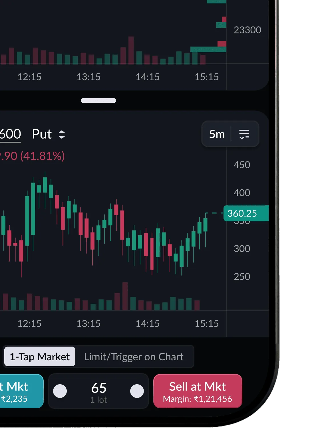
Screen readers hear 'Mask group.png' (twice), 'Mask group (1).png', '6.61ms.png' and 'trade-without-switching-tabs-call-put.png'. The chart controls add 'Candlestick chart control', 'edit pencil' and 'arrow line' to their names, from icons that are only decoration.
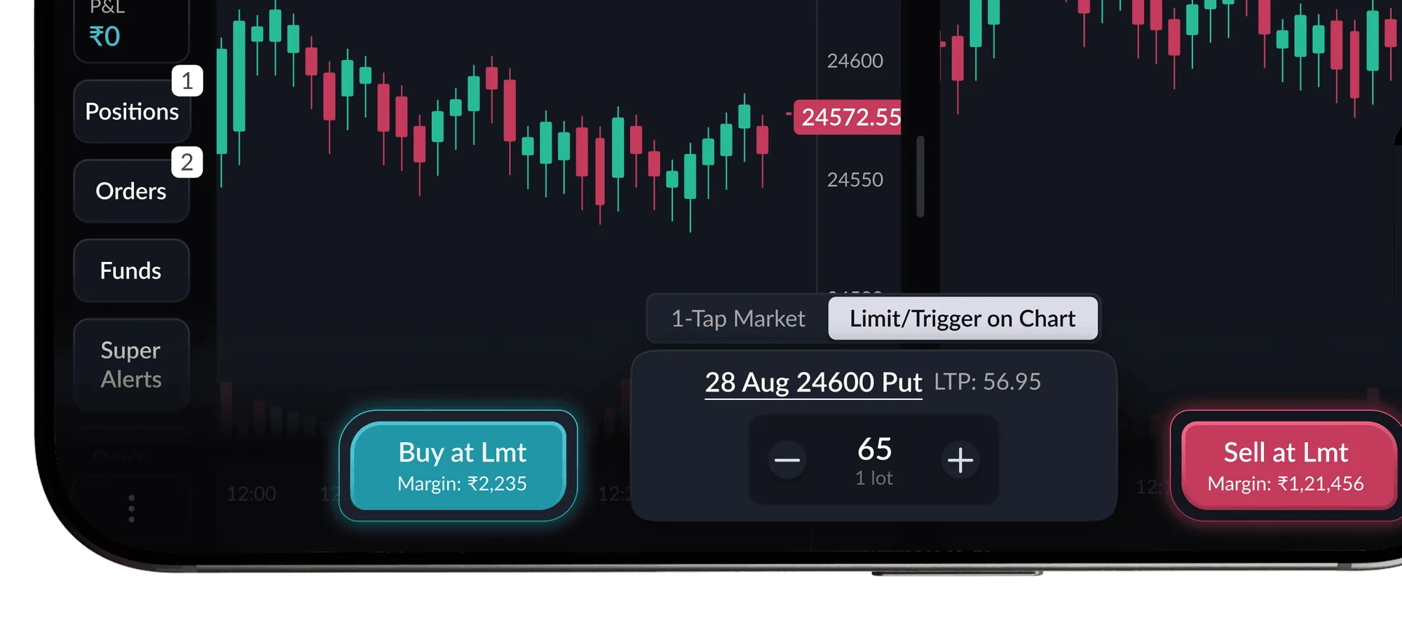
Our copy: Each picture is described (for example 'A Buy at Lmt ticket for the 28 Aug 24600 Put, placed from the chart'), decorative ones are silent, and each chart control is named only by its label.
-
MediumContentDesktop and phonecharts-10
Feature cards put their heading after the content it introduces
In 'Everything within reach' four of the seven cards put the heading below their content, in the markup as well as on screen. Screen readers read 'Max Pain, OI Profile, OI Resistance, OI Support' and then 'Exclusively Available on SAHI with', a heading that ends in 'with' and points at a list that sits above it.
Our copy: Every card's heading comes first. The exclusive-indicators card reads 'Exclusively Available on SAHI with' and then its list, top to bottom.
-
LowVisualDesktop and phonecharts-11
'More than 100+ indicators' is written over its own picture
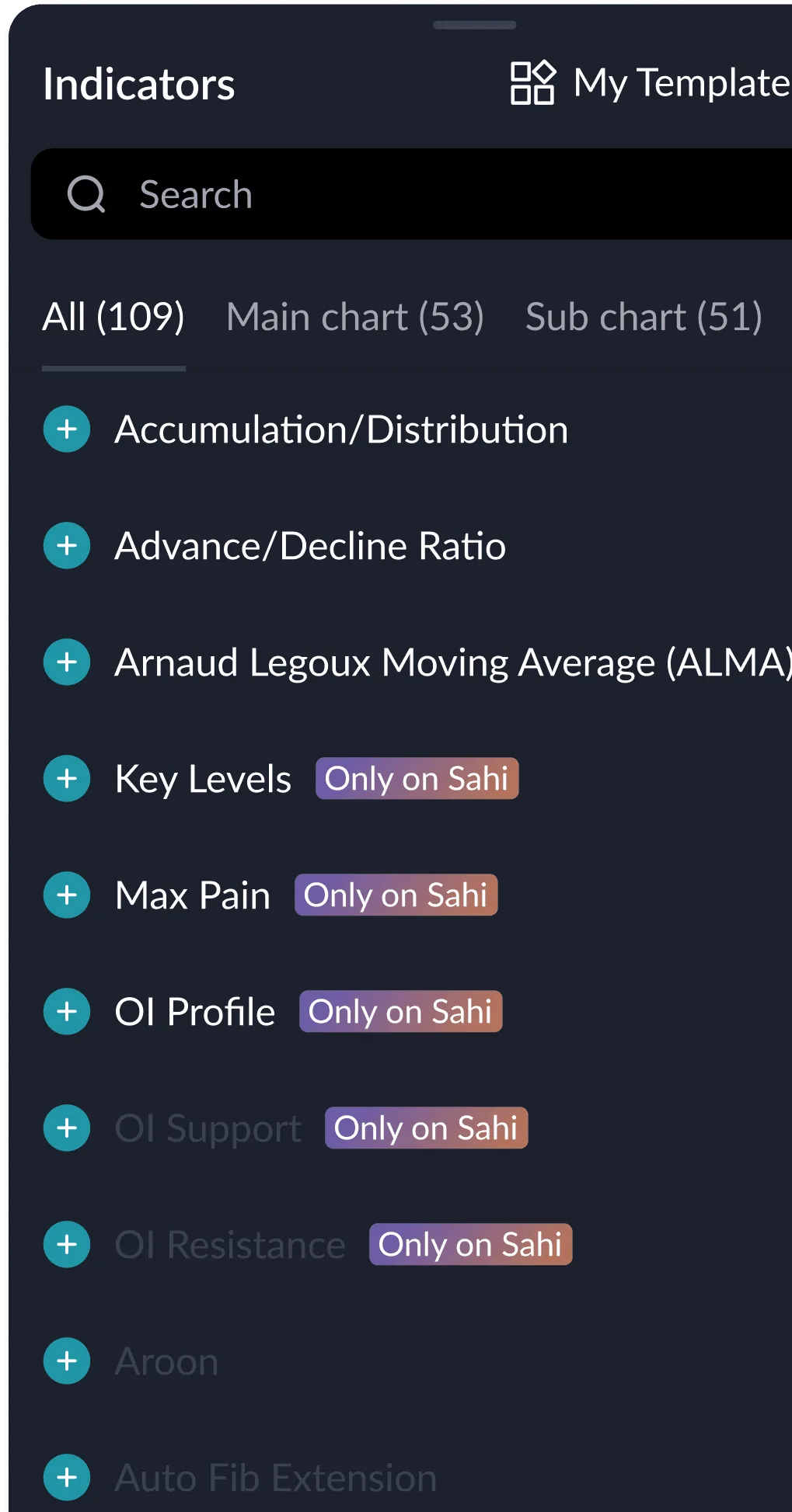
The heading is drawn on top of the indicator-list screenshot, and the 'OI Support' row with its 'Only on Sahi' tag shows through the letters. 'More than 100+' also says the same thing twice.
Our copy: The list fades out before the heading, which reads 'More than 100 indicators' (the list itself shows All (109)).
-
LowContentDesktop and phonecharts-12
Typos and missing punctuation
'from its servers to the exchange , measured' (a space before the comma); 'An in-house charting engine not a wrapped third-party library, so the chart and the trade are one system' (no comma after 'engine', no full stop); two FAQ answers end without a full stop ('build a focused setup', 'the broader trend'); the Hotkeys dialog says 'from the keyboard, No clicking' where the card says 'keyboard. No clicking'.
Our copy: Corrected; the words are otherwise sahi.com's.
-
LowAccessibilityDesktopcharts-13
Chart controls show their names only once selected
The dock under the charting demo is a row of icon buttons. Only the selected one shows its label; hovering another shows only the browser's delayed tooltip, and keyboard focus shows nothing (measured: the label stays at opacity 0 on hover and on focus).
Our copy: A control's label also appears on hover and on keyboard focus, and the controls follow the arrow keys, Home and End.
-
LowLayoutDesktopcharts-14
A lone dashed line floats in 464px of empty space
Between the last line of 'Lightning fast SAHI charts' and the 'Few seconds is all it takes' heading there are 464px of white with a single dashed line in them. The line leads to 'Trade Without Switching Tabs', a phone section that desktop hides, so on desktop it joins nothing.
Our copy: On desktop one short connector joins the two sections at normal spacing; on phones and tablets the line still leads into 'Trade Without Switching Tabs'.
-
LowLayoutDesktopcharts-15
Section widths and heading sizes jump
'Discover What’s New in Charts' runs 1360px wide, 40px from the window edges, while every other section lines up between 1064 and 1200px. 'FAQs' and the pricing heading are 60px, the size of the page title, while the other section headings are 44px.
Our copy: Every section sits in the same column, and every section heading is one size.
-
LowAccessibilityPhonecharts-16
The phone view switch shows where you are, not where it goes
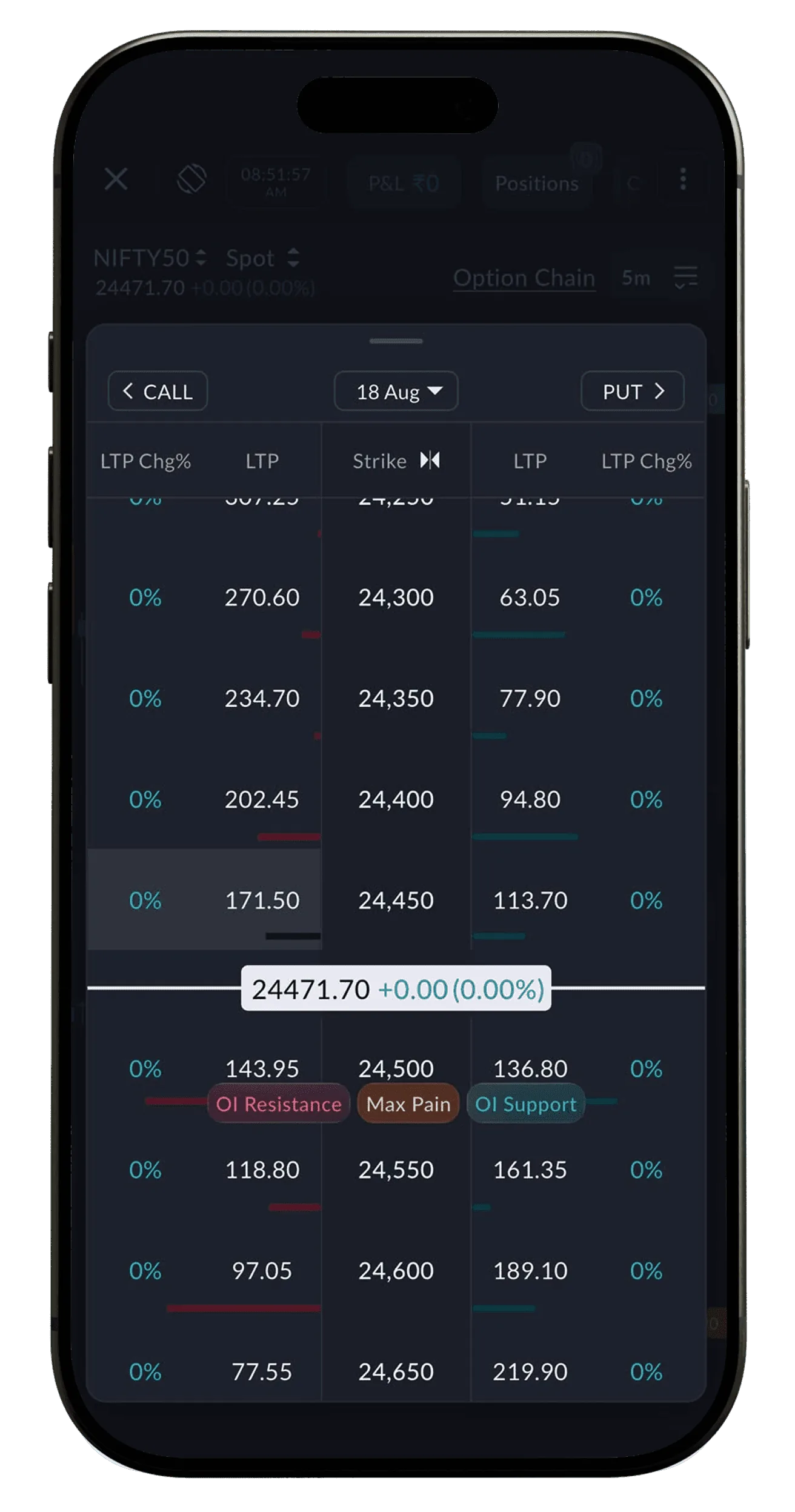
'Trade Without Switching Tabs' has one button showing the current view ('Index + Call/Put' with an up-down arrow). The other view, Option Chain, is invisible until you tap, and the button's spoken name, 'Switch to Option Chain', does not contain its visible text (WCAG 2.5.3).
Our copy: The two views are tabs side by side, each labelled with its name.
-
LowLayoutPhonecharts-17
Three price tiles take a whole phone screen
'High performance trading at unmatched value' stacks its ₹0, ₹0 and ₹10 tiles one under another on a phone, 237px each: 830px of an 844px screen for three numbers. Same on SAHI Scalper and SAHI Research.
Our copy: The three tiles sit side by side at every width.
-
LowVisualDesktop and phonecharts-18
The tab pills use a different selected style from every other pill
The Single and Multi chart tabs and the layout tabs mark the chosen tab with an outline only, at a different height and size from the pills on every other page.
Our copy: The same pill as the rest of the site: filled dark when chosen, 44px tall.
-
LowVisualDesktopcharts-19
"Join Waitlist" and "Learn More" sit at different heights
The two Custom Indicator cards have different amounts of text, so their buttons do not line up side by side.
Our copy: Each card button sits at the foot of its card, so the pair lines up.